
«Existence is exalting, as once curiosity is awakened; this exercise of curiosity transforms life into a poetic adventure.»
(Louis Pauwels & Jacques Bergier)
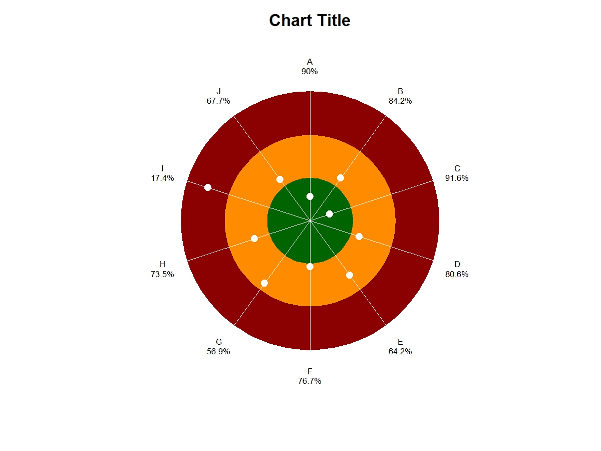
I am not used to share pieces of code but today I have been mesmerized by a chart: a target used to display a lot of information in a single image.

Fascinated by the idea of using a single circle to show so many data, I have written a short R code implementing that structure.
The target is perfect when you need to show the results of a lot of indicators i.e. proportions which must reach (and possibly exceed) a standard result.
If at least 75% of items from a series should work properly, and 80% of the actual items do work:
- 80% is the result of the indicator
- 75% is its standard
That’s a good result, because it exceeds the standard. The target is a good way to present, all at once, a lot of indicators whose results must be maximized (i.e. 0% is the worst result, 100% the best one.)
The R code requires the library plotrix.
require(plotrix)
Input data should be put in three arrays: names contains the names of the indicators, p the results of each indicator expressed in percentage, std the standards for each indicator, again expressed in percentage.
names<-c("A","B","C","D","E","F","G","H","I","J")
p<-c(76.7,90,73.5,84.2,91.6,80.6,64.2,46.9,37.4)
std<-c(80,95,80,90,90,80,95,90,70,75)
The second part of the code pictures the target, printing it in a jpg file.
pi <- 4*(4*atan(1/5)-atan(1/239))
N<-length(names)
gap <- std-p
rad <- rep(NA,N)
rad[gap<=0] <- 4 + 29 * (1-abs(gap[gap<=0])/(100-std[gap<=0]))
rad[gap>0]  <- 33 + 67 * (gap[gap>0] / std[gap>0])
jpeg(“target.jpg”,width=1200,height=900,res=100, quality=100)
plot(0,type=“n”,asp=1,xlim=c(-130,130),ylim=c(-130,130),axes=FALSE,xlab=“”,ylab=“”,main=“Chart Title”)
draw.circle(0,0,100,col=“darkred”,border=“darkred”)
draw.circle(0,0,66,col=“darkorange”,border=“orange”)
draw.circle(0,0,33,col=“darkgreen”,border=“darkgreen”)
for(i in 1:N) {
	segments(0,0,100*sin((i-1)*2*pi/(N)),100*cos((i-1)*6.28/N),col=“white”)
	x<-rad[i]*sin((i-1)*2*pi/N)
	y<-rad[i]*cos((i-1)*2*pi/N)
	points(x,y,pch=19,col=“white”,cex=2)
	x<-120*sin((i-1)*2*pi/N)
	y<-120*cos((i-1)*2*pi/N)
	text(x,y,paste(names[i],“\n”,p[i],“%”,sep=“”),col=“black”)
}
dev.off()
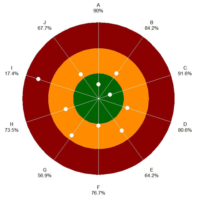
On the target, the result of each indicator is shown as a white circle on the corresponding radius; every radius corresponds to a distinct indicator.
The white circle is:
- in the center of the target when the result is 100%.
- inside the green area when the result is over the standard.
- on the outer green circumference when the result equals the standard.
- inside the orange or red area when under the standard.
- on the outer red circumference when the result is 0%.
This chart works well in situations where indicators have different standards, because data on each radius is normalized and the position of the white circle is based on specific scales, calculated according to the standard.
- Download the R code target.txt
- Download the output file target.jpg
BY-NC-SA 4.0 • Attribution-NonCommercial-ShareAlike 4.0 International